Tuesday, March 6, 2012

Blog 5 - Song Deconstruction

Song 1 - Original Super Bass, Nicki Minaj

Song 2 - Super Bass (Start at 33 seconds)


I picked to do these two songs because they were the similar yet completely different all at the same time. The original song, Super Bass, by Nicki Minaj gives more of an upbeat dance vibe, while the cover of this song by Drew Tobin is slower and more mellow. The lyrics are the same, with a few curse words changed, yet the songs give off two totally separate feelings. 
The musical qualities of the two are different also. When it comes to rhythm, the cover song has more of a regular rhythm. When it comes to the Nicki Minaj version, the rhythm seems regular but not, it is almost on the verge of irregular with a solid beat. The intensity of the songs are different also. The cover song is very soft while Minaj's version is louder. The pitch in the cover song is lower than the pitch is Minaj's chorus. When she raps though, the pitch is lower, similar to the pitch in the cover song. When it comes to timbre, both songs have a very simple timbre that adds to the catchiness of their songs, and they both have a very ordered organization. The speed of the cover is much slower than the speed of the original version, yet they still sound just as good. The melody of both songs are very catchy and very easy to listen to, allowing for both songs to be very popular. 
Personally, I am more interested in music that has a source that is simple, only a few instruments, so that makes me more drawn towards the cover version. I do appreciate the original version when I am listening to the radio or having a good time, but for relaxing I would much rather listen to the cover. The groove is much more appealing to me than the upbeat, overexcited, groove of the original by Nicki Minaj. 

BLog 6- Storyboard Animation


When directing this scene, the director followed all of the rules pretty closely. First, he established the 180 degree line, and did not cross it. The shot went from the first man, to the second man, to the horse, but stayed on one side of the 180 degree line the whole time. The eye line of the man goes directly to the man at the computer, and then the shot cuts to that man. The man is looking at the computer the whole time, so there is no problem when the final shot is of the horse on the computer. This final shot is helpful because it is the punchline of the whole scene. 
The Rule of Thirds is not followed throughout the whole clip. In the first shot, that is what the third man is for, to fill out that section in the rule of thirds. Then the second shot, the mans head is directly on one of the dividing lines, drawing all of our attention to him. And the final shot is composed of just the horse, by the horse takes up exactly one third of the shot. 
This scene does not have enough shots to make the Rule of 30 a real problem. The shots are clean and simple because it just starts with one wide shot, then jumps to a close up, so the 30 degrees that the camera should be separated does not matter much. 
This director knew what he was doing when he put this clip together. All of the rules that can be followed are, and it makes these five seconds seem clean and professional. 

BLog 8


The theme, or themes, of this movie, "The Social Network", would be ones of power, jealousy, and deceit, themes that follow movies all the way back before they were even created. These are themes that are prevalent in Shakespearean plays and stories since the beginning of time, yet "The Social Network" takes is to a whole new level. This is more of an active theme because the viewer is plainly being shown the egotistical and power hungry side of Mark Zuckerberg. This scene is plainly one that shows the theme of a strive for power and recognition. Zuckerberg already has what he wants, while the Winkelvos twins want the recognition for what he already has.
When critiquing this scene, space and rhythm help convey this scene. The space that they are in is crowded, except for the area around Mark Zuckerberg, which shows that he has all the power and control. The actions of the actor, Jesse Eisenberg, also help to convey that this character has all of the power that he has ever wanted. He creates a lot of tension by making this huge speech a response to one simple question, and you think that he is going to blow up in the lawyers face, and in some way, he does. But, there is a release when he ends his speech and calmly tells the lawyer how he really feels, and asks him another question in return. This second question that is asked takes the short term power from the lawyer and hands it over to Mark Zuckerberg. With an ego like Zuckerberg has, he thinks that he deserves the power and he takes what he rightfully sees as his.
The rhythm of this scene is very quick. The shots go back and forth between the lawyer and Zuckerberg at a fast rate, and then lands on Zuckerberg, giving him all of the attention and power between the conversation. This scene is a pivotal part of Zuckerbergs character and shows that he has no remorse for the actions that he has taken through out his life.

Blog 7 - Animation Deconstruction


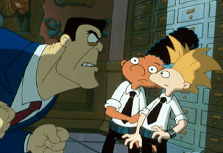
Both of these stills are from the cartoon show Hey Arnold on Nickelodeon. I decided to choose them because they were both similar when it came to lighting. The two good character, Arnold and Gerald, are placed in the light, while the bad characters are shadowed. It brings a bit of a dark, scared, mood to the scene. Two menacing characters are in the shadows and dressed in dark colored clothing. The color of the outfits that Arnold and Gerald are wearing are different. In the first scene, they are dressed in colorful clothing, while the bad guy is dressed in a hue of grays. Their brightness stands out more in the light. Arnold, the main character, sticks out even more than Gerald because his clothes are brighter, contrasting, and hes placed further in the light, putting the focus on him. In the second scene the boys give off a good guy vibe because of how they are dressed in white. Not only does the bad guys have a square shaped head compared to the two boys more rounded ones, he is dressed in darker colors, making him come off as more menacing and evil.
There really is no saturation in this cartoon, all of the colors are a bit dull. Though their backgrounds are all made up of dark hues. The first one is all blues, while the second one is all grays. The two boys stand out from both backgrounds because their colors are contrasting from the evil characters and their backgrounds. Each shot somehow has a light in the center that lights up the whole scene.
In the first scene, Arnold and Gerald have contrasting movements. One is leaning away while the other is leaning towards the evil man. These are overlapping movements because there are so many happening at the same time. The weight of the characters is prevalent through their size and how they are standing. The evil man seems light by his jumpy movements and the boys seem light through their small stature.
In the second scene there are parallel movements by Arnold and Gerald. They are hovering together and in the same direction. The weight of the bad man is seen by how large he is and how he is leaning forward, making the two boys cower.