Tuesday, March 6, 2012

Blog 5 - Song Deconstruction

Song 1 - Original Super Bass, Nicki Minaj

Song 2 - Super Bass (Start at 33 seconds)


I picked to do these two songs because they were the similar yet completely different all at the same time. The original song, Super Bass, by Nicki Minaj gives more of an upbeat dance vibe, while the cover of this song by Drew Tobin is slower and more mellow. The lyrics are the same, with a few curse words changed, yet the songs give off two totally separate feelings. 
The musical qualities of the two are different also. When it comes to rhythm, the cover song has more of a regular rhythm. When it comes to the Nicki Minaj version, the rhythm seems regular but not, it is almost on the verge of irregular with a solid beat. The intensity of the songs are different also. The cover song is very soft while Minaj's version is louder. The pitch in the cover song is lower than the pitch is Minaj's chorus. When she raps though, the pitch is lower, similar to the pitch in the cover song. When it comes to timbre, both songs have a very simple timbre that adds to the catchiness of their songs, and they both have a very ordered organization. The speed of the cover is much slower than the speed of the original version, yet they still sound just as good. The melody of both songs are very catchy and very easy to listen to, allowing for both songs to be very popular. 
Personally, I am more interested in music that has a source that is simple, only a few instruments, so that makes me more drawn towards the cover version. I do appreciate the original version when I am listening to the radio or having a good time, but for relaxing I would much rather listen to the cover. The groove is much more appealing to me than the upbeat, overexcited, groove of the original by Nicki Minaj. 

BLog 6- Storyboard Animation


When directing this scene, the director followed all of the rules pretty closely. First, he established the 180 degree line, and did not cross it. The shot went from the first man, to the second man, to the horse, but stayed on one side of the 180 degree line the whole time. The eye line of the man goes directly to the man at the computer, and then the shot cuts to that man. The man is looking at the computer the whole time, so there is no problem when the final shot is of the horse on the computer. This final shot is helpful because it is the punchline of the whole scene. 
The Rule of Thirds is not followed throughout the whole clip. In the first shot, that is what the third man is for, to fill out that section in the rule of thirds. Then the second shot, the mans head is directly on one of the dividing lines, drawing all of our attention to him. And the final shot is composed of just the horse, by the horse takes up exactly one third of the shot. 
This scene does not have enough shots to make the Rule of 30 a real problem. The shots are clean and simple because it just starts with one wide shot, then jumps to a close up, so the 30 degrees that the camera should be separated does not matter much. 
This director knew what he was doing when he put this clip together. All of the rules that can be followed are, and it makes these five seconds seem clean and professional. 

BLog 8


The theme, or themes, of this movie, "The Social Network", would be ones of power, jealousy, and deceit, themes that follow movies all the way back before they were even created. These are themes that are prevalent in Shakespearean plays and stories since the beginning of time, yet "The Social Network" takes is to a whole new level. This is more of an active theme because the viewer is plainly being shown the egotistical and power hungry side of Mark Zuckerberg. This scene is plainly one that shows the theme of a strive for power and recognition. Zuckerberg already has what he wants, while the Winkelvos twins want the recognition for what he already has.
When critiquing this scene, space and rhythm help convey this scene. The space that they are in is crowded, except for the area around Mark Zuckerberg, which shows that he has all the power and control. The actions of the actor, Jesse Eisenberg, also help to convey that this character has all of the power that he has ever wanted. He creates a lot of tension by making this huge speech a response to one simple question, and you think that he is going to blow up in the lawyers face, and in some way, he does. But, there is a release when he ends his speech and calmly tells the lawyer how he really feels, and asks him another question in return. This second question that is asked takes the short term power from the lawyer and hands it over to Mark Zuckerberg. With an ego like Zuckerberg has, he thinks that he deserves the power and he takes what he rightfully sees as his.
The rhythm of this scene is very quick. The shots go back and forth between the lawyer and Zuckerberg at a fast rate, and then lands on Zuckerberg, giving him all of the attention and power between the conversation. This scene is a pivotal part of Zuckerbergs character and shows that he has no remorse for the actions that he has taken through out his life.

Blog 7 - Animation Deconstruction


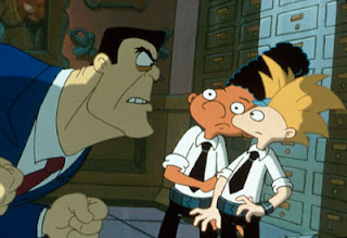
Both of these stills are from the cartoon show Hey Arnold on Nickelodeon. I decided to choose them because they were both similar when it came to lighting. The two good character, Arnold and Gerald, are placed in the light, while the bad characters are shadowed. It brings a bit of a dark, scared, mood to the scene. Two menacing characters are in the shadows and dressed in dark colored clothing. The color of the outfits that Arnold and Gerald are wearing are different. In the first scene, they are dressed in colorful clothing, while the bad guy is dressed in a hue of grays. Their brightness stands out more in the light. Arnold, the main character, sticks out even more than Gerald because his clothes are brighter, contrasting, and hes placed further in the light, putting the focus on him. In the second scene the boys give off a good guy vibe because of how they are dressed in white. Not only does the bad guys have a square shaped head compared to the two boys more rounded ones, he is dressed in darker colors, making him come off as more menacing and evil.
There really is no saturation in this cartoon, all of the colors are a bit dull. Though their backgrounds are all made up of dark hues. The first one is all blues, while the second one is all grays. The two boys stand out from both backgrounds because their colors are contrasting from the evil characters and their backgrounds. Each shot somehow has a light in the center that lights up the whole scene.
In the first scene, Arnold and Gerald have contrasting movements. One is leaning away while the other is leaning towards the evil man. These are overlapping movements because there are so many happening at the same time. The weight of the characters is prevalent through their size and how they are standing. The evil man seems light by his jumpy movements and the boys seem light through their small stature.
In the second scene there are parallel movements by Arnold and Gerald. They are hovering together and in the same direction. The weight of the bad man is seen by how large he is and how he is leaning forward, making the two boys cower.

Sunday, January 29, 2012

Reflections - Blog 4

Old Habits


This clip does well with sound when it comes to the music and the end and the slamming of the door, but the use of space is limited. The context of this clip though does limit that, a 5second Film is supposed to be only five seconds, which is what gives it its popularity, so the use of space in a scene cannot be too much, or your time wold be exceeded. You are using semantic listening to gain the information that there is a horse on the other end of the computer, talking to the man who was obviously raised in a barn, which is one of our listening modes. As the first man slams the door, our focus is turned directly toward him, making us use referential sound. This is exactly what we need to see and exactly where our attention goes because it is the basis for the entire scene ahead. When it comes to space, we follow the directionality of the first man as he enters the room through the door and then immediately exits the other side, going from left to right. The movement in this scene is small since two out of the three humans that are in the scene are sitting, while one moves. The movement of man two as he speaks to his horse is slight, but still enough to convey the emotion needed to let the audience know that he WAS raised in a barn and he does miss his horse. 

Deconstructing a Character

Protagonist
This character would be the type who could not contain their brightness. They have a strange personality  that compliments, or brightens, the other characters that surround him. Many different roles can fit to this character, just like this picture has many different colors and aspects, but either way, they come to one central point. The vibrancy of their attitude adds some comic relief to the story's plot which gives the character the opportunity to either contribute to the direction that the main character wants to take, or just add some compliment.
Being the brightest is not the role of this character, but when the character that they compliments goes out, they are there as the perfect substitute.  Just like the light of a candle, this person is one who often falls into the background until they are necessary. Adding a nice accent to the film is what this character accomplishes best, but can be used towards the plot if necessary. This character can be used in the background or can be placed in the spotlight, depending on which way the plot takes them, making this character very versatile.
Just like a square, this character is typically very straight forward. Unlike their counterparts, they have an antagonist that steals their light in the way they look. They are more squatly shaped, giving them a portly feel and the ugliness adds humor to their character. They are happy though, like the color of this square, making them ok with the way that they look and are represented. This character would not necessarily move well through-out scenes, just like a square does not move well through spaces.

Antagonist


This characters color pallet is very dull and dark, because it compliments their personality. They would be perceived as mean and moody, and would most likely shoot down the protagonist whenever possible. This character cannot have many different roles, it is very straight forward. They have one face and one color scheme. 
The light that this person resembles is very dull, just like the color. They cannot light up a room and make things brighter, and he cannot make a situation brighter.  The amount of personality and light that he adds is very minimal compared to his counter part. Also, like a lamp, his temper can be ignited at the flip of a switch. The anger spreads through the situation, like dull light in a dark room, and adds a different atmosphere. 
This person is taller and thin, just like this jalapeno. They also have a hot temper like the jalapeno and their heat can be easily released. The lankyness that this person posesses makes him seem more intimidating and odd looking. He is the opposite of the protagonist, where the good guy is squat, this guy is tall and awkwardly shaped. 

Finding Your Howl - Blog 2

"Howl"


            One of the stories in Flaum’s article is about a few rare red wolves who had been placed within captivity, taking away all that they knew. This basically represents putting restrictions on a person’s life. One of the wolves, Mumon, went out to find what had been taken from him, and that gave him the courage to do bigger and better things, actions that he would never have tried if in a pack or restricted by the confines of captivity.  Eventually, after a series of events, Mumon finds who he is again, he finds his “howl”.  Mumon imagines himself invincible and getting that freedom was a real experience and journey.
             

Creativity is just connecting things. When you ask creative people how they did something, they feel a little guilty because they didn't really do it, they just saw something. It seemed obvious to them after a while. That's because they were able to connect experiences they've had and synthesize new things.
-       Steve Jobs


Personally, Steve Jobs is a creative inspiration and the worst loss the future of our technological industry could take.  This man was brilliant because he did not think of what the people wanted, but what he knew they would eventually want. That is thinking outside the box if I have ever heard it, thinking beyond the masses and realizing what people don’t know they want before they do. That is genius creativity and what creativity should be, giving people something unexpected.
            If I could do one thing it would be sit and a room and think of things that have never been thought of before, but that is much harder to accomplish in the field that I want to get into than one would expect. Every idea in the entertainment industry has been used and reused over and over again, making the idea of intellectual property unbearable.  No one has their own ideas, everyone takes everyone else’s and tries to tweak it, but in the end, the same product arises.
            Everyone’s good idea gets turned into another person’s better idea, and yea that would make a person with good moral compass feel guilty, it makes me feel guilty, but no person in the industry has a good enough moral conscious to care about stealing an idea.
            The best ideas have already been done, which make them hard to top and impossible to replicate, but the thing about what Steve Jobs said that sticks out the most to me is how all ideas intertwine. One day, a man was watching a brilliant movie , Apocalypse Now, and the next he was making a brilliant comedy, Tropic Thunder. That is how the system works, everything spirals after each other.
            This is the way I get my best ideas, when I am sitting there thinking about a certain project for a while and then a new idea will enter my mind. Two different ideas connected to created a brand new idea. Old ideas give birth to the new ones, the trick is that you have to be the first to come up with the newborn idea. Creatively, this is restricting and uncomfortable, but Jobs was a smart man, so I trust what he says.
            When I try to be creative this is how I think, it is kind of like putting yourself down, but in a creative positive results way. I tell myself that I need to understand that all good ideas are repetitive, not exactly replicas though. 
            Being in a creative team is one of the only ways to succeed. Those ideas that you all have that seems to be repeating themselves all come together to create a new idea and a brilliant one at that. Teams are what makes the world go round.  When I try to work solo, my creative world seems crowded and unbearable, but when the ideas are distributed and shared between multiple individuals, all with different points of view and ideas, those old ideas intertwine and succeed. Everything clicks, everything becomes obvious, and everything falls into place.